Home | CSS | Tables | Images | Typography | Layout | Designing for Devices | Color Theory | Forms | Dreamweaver Features | Resources | Accessibility
Web Site Layout
Here are a few definitions you should know:
- Tracing Image - This is an image you can place in the background which will allow you to align your web page images in the exact same location and style as the background image. This image is not seen when your page is viewed in a browser. Use this when you want the exact same placement as on another page.
- AP Div - Short for Absolutely Positioned <div> tags, these can be used to specify a specific location on a web page for your chosen content. Use this when you know exactly where something should go.
- Table - One can make the layout of their web site look nicer by placing your content inside of a table. Modifying table cell data, and then making the border thin or transparent, you can make your arrangement a lot nicer and a lot more professional-looking.
In Review:
1. Client success criteria is a set of criteria meant to help you design your website, defining its purpose and helping keep the site relevant. It's important because you want your audience to come back to your site for the very reason you designed it. If your content doesn't match your topic, they'll leave and never return to it.
3a. emphasis - Emphasis is important because it shows your main points to your audience through the use of bold text, italicized text, etc.
3b. contrast - Contrast is important because it visually represents your site. Keep your elements seperate and your site will look more appealing.
3c. sense of balance - This is important because you don't want your site to become garbled with all text on one side and all images on the other. Keep a proportionate balance between them across the page, and it will look more appealing to your visitors.
3d. arrangement - This is important because lined up, connected elements make a site seem more wholly fulfilling when searching for a site on a particular topic.
3e. repetition of elements - Repetition is important because the more you use an element, the more the reader will think of it as important and relevant to the site as a whole.
3f. visual direction - This is important because you do not want to confuse your reader. If they have to jump all over the page to read something, then they likely won't spend a lot of time viewing your site and will search further for something else. It's also a lot less professional.
4. Because it exemplifies the use of repetition - the more it's seen, the more important it is to the reader and the more apt they are to think they matter.
Internet History Sourcebooks Project
http://www.fordham.edu/halsall/
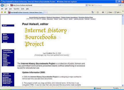
Side Navigation
I like this site. The navigation links are all on one side, and the page itself is easy to read. The blue background to the navigation makes the white text stand out and more pleasing to the eye.
|
 |
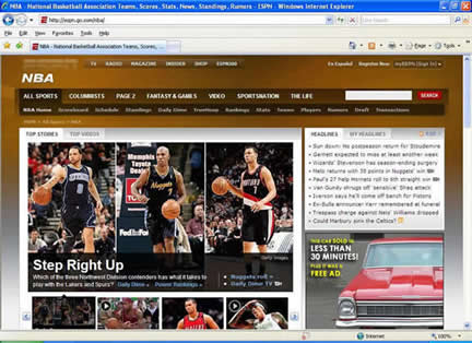
NBA - National Basketball Association Teams, Scores, Stats, News, Standings, Rumors - ESPN
http://espn.go.com/nba/
Top Navigation
While it's nice to see the top navigation, most of the time when I visit this page I tend to look to the right side for links I'm into clicking on because that's where the news stories can be found. Recently redesigned, I preferred the old site better. It had a similar look but it was much easier to find things, and everything in the middle didn't look so garbled up.
|
 |
|
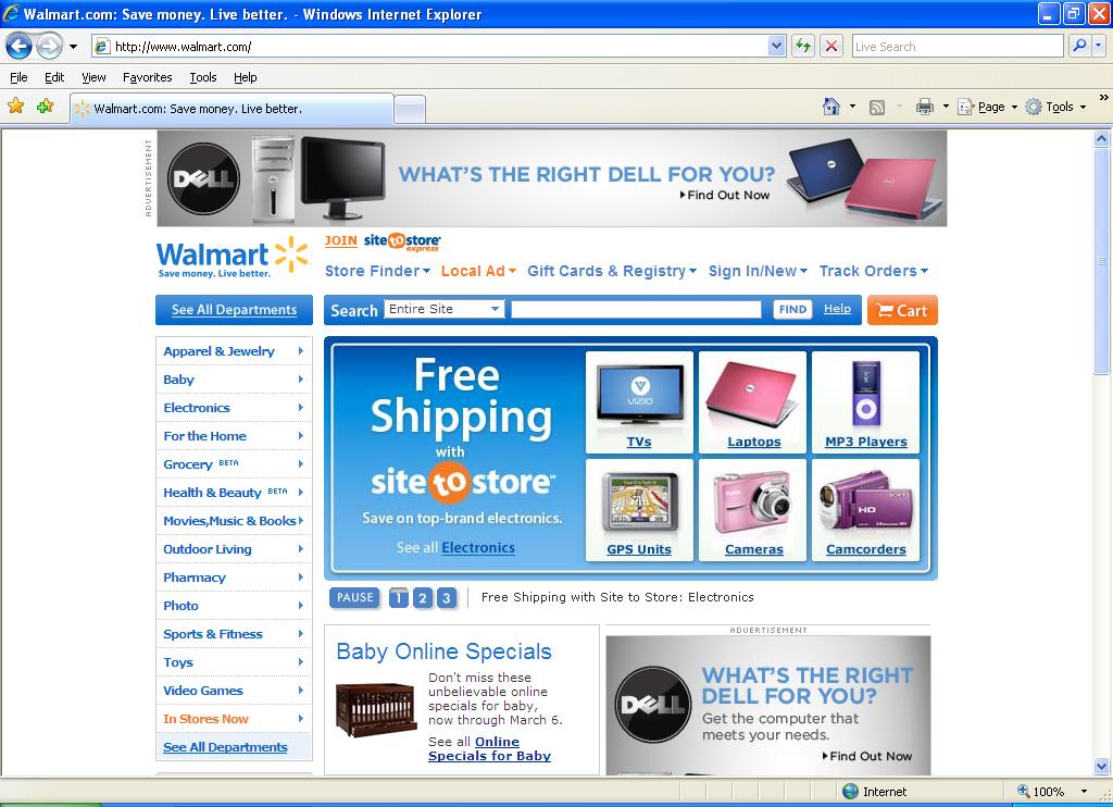
Inverted L Shape
I like Walmart's website because everything is nicely organized either along the left, or along the top. The most commonly used links are at the left, allowing visitors to browse various departments as they search for merchandise they wish to purchase. |
|
Black Hawk College
http://www.bhc.edu/
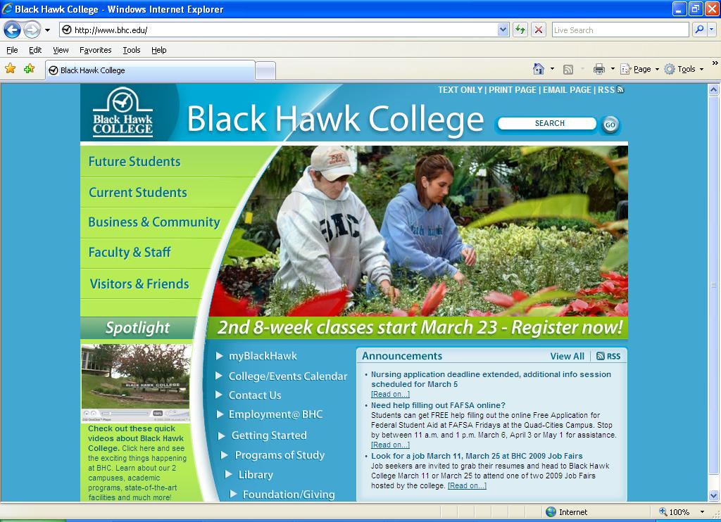
Side Navigation
I like BHC's website. The use of the side navigation allows the visitor to quickly find any information they are looking for in the area in which they are needing it. When the link is rather broad, it leads to a new page with links organized even further.
|
|
Genesis Health System - Genesis Health System
http://www.genesishealth.com/
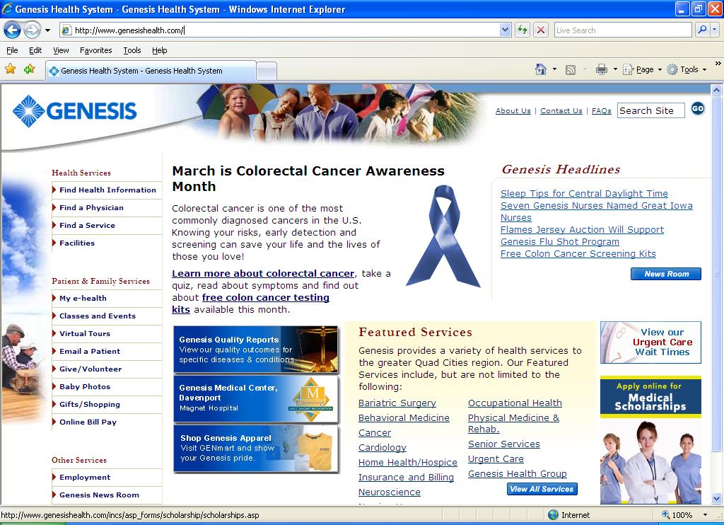
Side Navigation
I do not like the layout of this site because there are links all over the place. It's really easy to click on one link when you intended to click on a different one.
|
|