Home | CSS | Tables | Images | Typography | Layout | Designing for Devices | Color Theory | Forms | Dreamweaver Features | Resources | Accessibility
Designing a website for people to view on the go isn't as difficult as you might think. Dreamweaver CS3 can easily help you not only design your site, but also make it compatible with many portable devices such as PDAs, cell phones, etc. And people will certainly appreciate the ease of use of your website! They will return to the site, driving up its popularity.
Imagine you have a cell phone with internet access enabled. You are sent via text messaging a link to a site that your friend wants you to check out, and you want to check it out right now. Will that link look good on your phone? That would depend on how the site was coded/designed. If it looks rather poorly, it might turn you off on that specific website, and the website in turn could lose a lot of visitors.
| Media Type | Description |
|---|---|
| all | Used as the default media type by CSS if nothing else is specified. As a result, any device accessing the site will use this style sheet to render the contents of the page. |
| braille | Used for Braille tactile feedback devices. |
| embossed | Used for Braille printers. |
| handheld | Used for handheld devices, such as PDAs and cell phones. |
| Used for printing and print previews. | |
| projection | Used for projectors. |
| screen | Used for computer displays. |
| speech | Used for speech synthesizers. There is a complete section of the CSS specification intended for aural representation of data. |
| tty | Used for Teletypes and other devices intended for the hearing impaired. |
| tv | Used for television displays, such as Microsoft's WebTV. |
Attaching a Printer-Friendly Style Sheet means defining a style sheet used only when you want to leave off specific portions of a page when it is printed. To make one, all you do is attach a new style sheet, and when the Media pop-up menu appears, select or type "print" and then click OK.
With the print-media style sheet now attached, let's create the rules. Simply having the style sheet isn't enough. You will make the rules as you customarily do, but you will want to define the rules in print.css instead of your existing style sheet. Be sure that you make a new rule for each element you want hidden when printed.
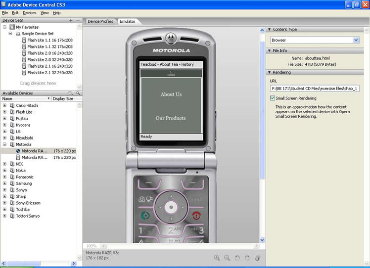
Finally, let's have a look at your web page as viewed in a cell phone. To do this, we will use Adobe Device Central. Go to File, click on Preview In Browser, and select Device Central. This will load up Device Central, where you can see how your web page(s) will look on a given cell phone. There are many different ones to try!
Here is a screenshot of a web page as viewed in a cell phone: